
![]()
Screen printing is a true form of artistic expression, and its aficionados have stuck around through the years. Even today, faced with ready-to-use digital printing or the simplicity of mass-produced offset printing (they call it offset lithographs to sound arty), it nevertheless fills a gap: bringing back original, affordable works that revive the craftsmanship of traditional printmaking. By combining the standards of fine art with a bold, often minimalist or vintage-inspired graphic style, the aesthetic of screen printing continues to captivate us endlessly.
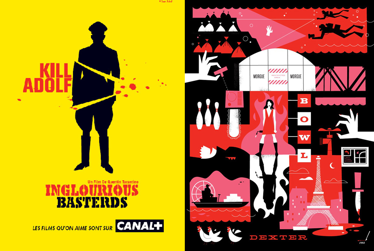
Although these Canal+ movie posters were not screen printed—unlike the Dexter series illustrated by Ty Mattson—they share a certain kinship: flat colors, simplicity, and thoughtful composition.
The process of printing with successive layers of color is fundamental to the aesthetic of screen printing. The constraint of working with a limited number of colors has evolved into a style of its own—one that nonetheless demands a unique blend of artisanal expertise and artistic sensibility. Illustrator Laurent Durieux describes it this way: “We create images on a computer using cutting-edge software […] but they are also printed by artisans on real paper and delivered to enthusiasts who experience genuine emotion. It’s a virtuous cycle. The artisans select the colors and apply them by hand. It’s a warm, human craft, with all its strengths and imperfections. On-screen, the posters are appealing, but in person, they’re astonishing. From the texture to the vibrancy of screen printing’s colors, the result is simply breathtaking.” (Art Interview – 2020)
In the United States and beyond, most graphic designers practice screen printing at their kitchen table. It’s nothing short of a religion! Schools like CalArts in Los Angeles have played a key role in restoring the prestige of artistic screen printing. In France, however, its politically charged, countercultural roots kept it discreet, even invisible. It wasn’t until much later that design and fine arts schools recognized its true potential: screen printing is an ideal tool of expression for graphic designers. A well-deserved revival after years of disgrace.
The Revival of Screen Printing
Since the early pioneers of screen printing (whose secret story I invite you to explore), the technique has traditionally been an industrial process—mainly for textiles and advertising materials. Yet, it quickly proved to be a powerful medium for reproducing paintings, illustrations, and later, even comic art. In the 1940s and 1950s, through artists like Vasarely, Fernand Léger, Poliakoff, Bozzolini, and many others, it became part of a bold and modern artistic movement — though one that remained largely inaccessible. Outside of galleries and institutions, however, graphic designers transformed this discipline into a vibrant, multicultural, and widely accessible art form. On the poster’s paper, screen printing and graphic design merge text and image, much like color blends into ink—a fusion I call serigraphics.
In 1946, in the United States, Max William Stanley Hayter (founder of Atelier 17) wrote in an article for the journal Serigraph Quarterly: “The greatest value of serigraphs is that they allow artists to create color reproductions of their own work.” In these few words lies the full weight of the misunderstanding surrounding screenprinting! It is precisely when screenprinting stops being just a method of reproduction and becomes a means of creation that pieces specifically designed for this technique acquire the status of original artworks : serigraphy.
In the 1960s, with Andy Warhol, Robert Indiana, Roy Lichtenstein, and Robert Rauschenberg, followed by Ernest Pignon-Ernest in the 1970s and Keith Haring in the 1980s, screen printing became the go-to medium for producing high-quality artistic prints, closely tied to Pop Art. But if, for you, screen printing is just Andy Warhol’s Campbell’s soup cans and Marilyn portraits, then it’s time to rethink everything—contemporary screen printing has a brand-new story, and it begins in New York and California!
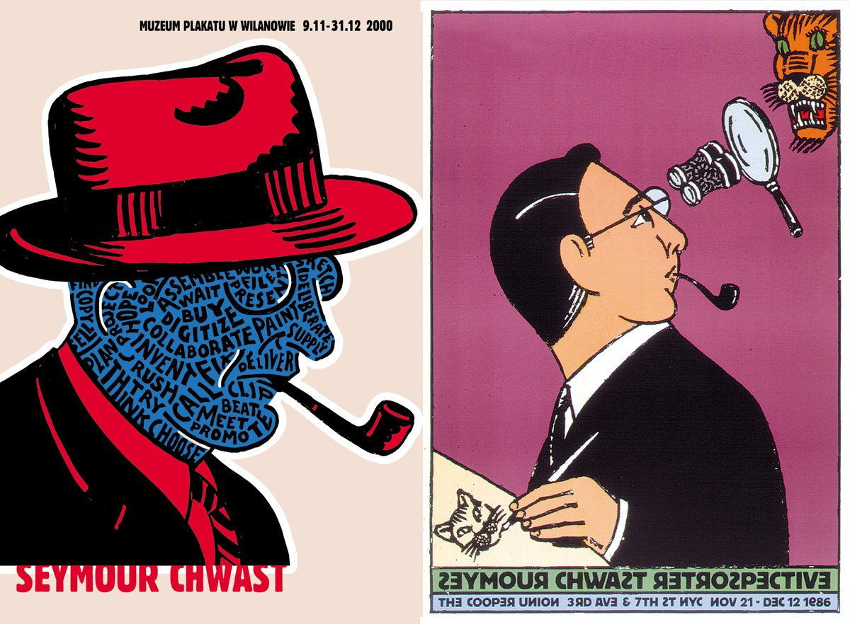
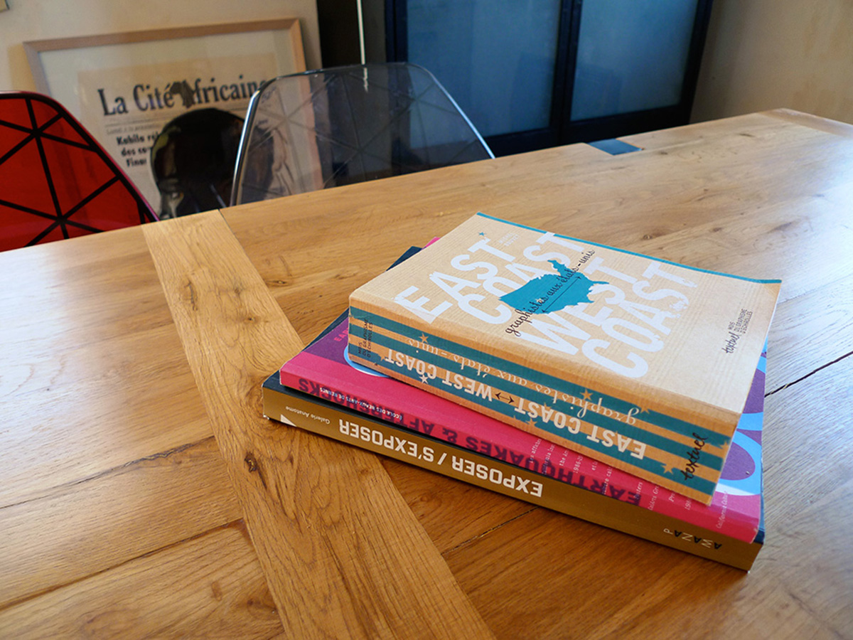
In 1960s New York, Seymour Chwast pioneered a form of free and rebellious expression—crisp lines, humor, and vivid flat colors, all shaped by the constraints of screen printing. “The relationship between Seymour Chwast, the grandfather of contemporary graphic designers, and today’s Californian designers was striking to me. A breed of constant ludic invention is played out between teeming details and, ultimately, an extreme graphic simplicity. Push Pin Studio was considered at the time as the Beatles of graphic design—their style was copied through the world.” (Michel Bouvet in Earthquake & Aftershocks / Presses universitaires de Rennes).
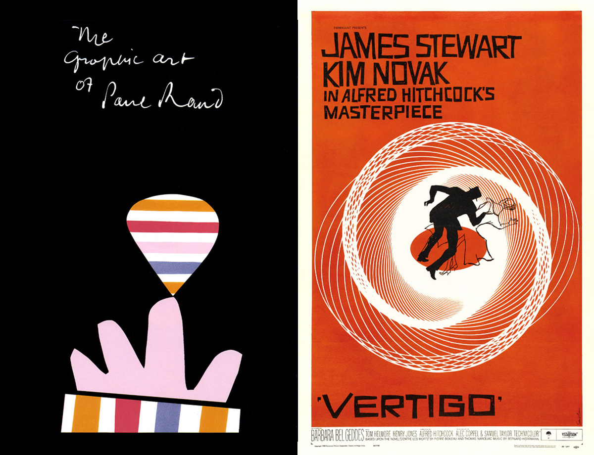
Also hailing from New York, Paul Rand was the first superstar graphic designer in American advertising, while Saul Bass (who lived in Los Angeles until 1996) became renowned for his posters, printed in the thousands for the film industry. Some of the original posters, screen-printed and numbered (ranging from 50 to 150 copies each) were produced in very limited quantities under the personal direction of Saul Bass (until 1984). They represent the definitive version envisioned by the artist, making them highly valuable. Vertigo, West Side Story, The Man with the Golden Arm, Anatomy of a Murder… He created a timeless and breathtaking style of simplicity: an absolute master!
“What is the difference between European graphic design and American graphic design, and Californian design in particular? Type holds an important place in the United States, which it absolutely does not hold in Europe […]” (Michel Bouvet in Earthquake & Aftershocks / Presses universitaires de Rennes).
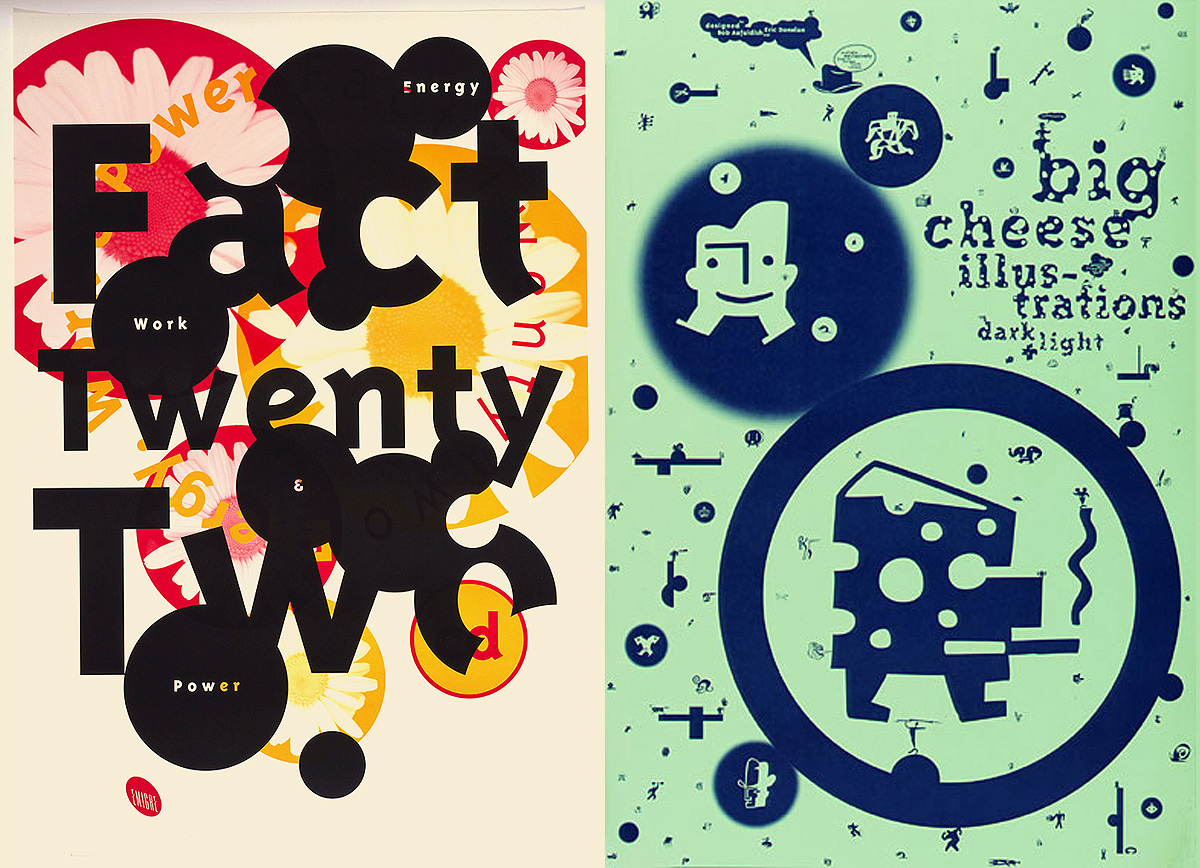
California-based graphic designers (Reverb, Jeff Keedy, Stripe, Gail Swanlund, David Carson) embody the surf attitude! Their graphic expression carries a unique rhythm, technicality, and ease of composition. Naturally, the renowned magazine Emigre rides its waves from the heart of Silicon Valley, at the epicenter of the digital and computing revolution of the 1980s. Initially powered by the photocopier (!), and later with the advent of the Macintosh, they were finally able to explore imagery and reinvent typographic design.
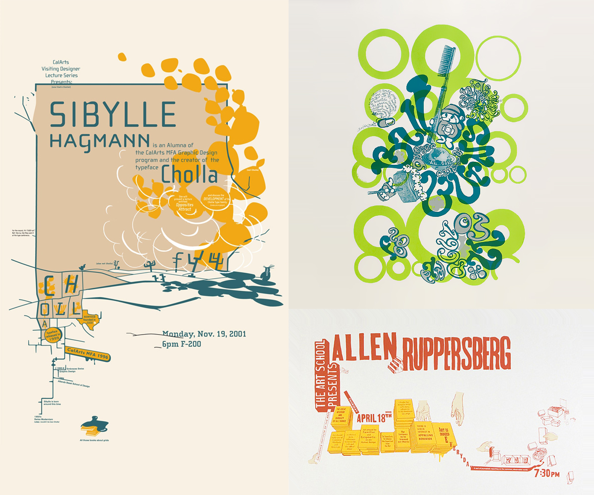
Posters created in screen printing by Jen McKnight (2001), Hwee Min Loi (1998), Jon Sueda (2002).
Americans have always influenced graphic culture, driven by a desire to push ink onto paper. It’s also a playful use of printmaking that brings a fresh, whimsical quality to the juxtaposition and arrangement of text. This way of manipulating typography, playing with the space on the page to create rhythms and breaks… This approach of turning away from the fully digital, embracing DIY techniques like tinkering, collage, and hand lettering—this is what typographer Barry Deck and graphic designer Jon Sueda (of Hawaiian descent) embody so brilliantly today. The fanzine also belongs to this DIY movement, where the computer is merely a tool, a means to transition from pencil to screen printing, from counterculture to cultural fusion.
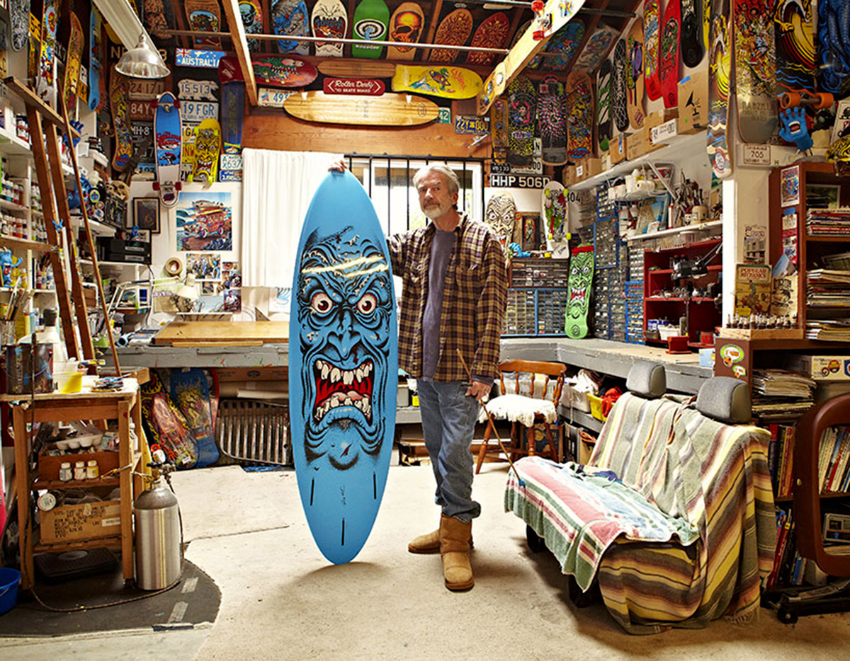
The “monstrous” surf, skate, and rock art of graphic designer Jim Phillips, also known for his iconic “screaming hand.” Photo: Matt Barnes via Hypebeast.
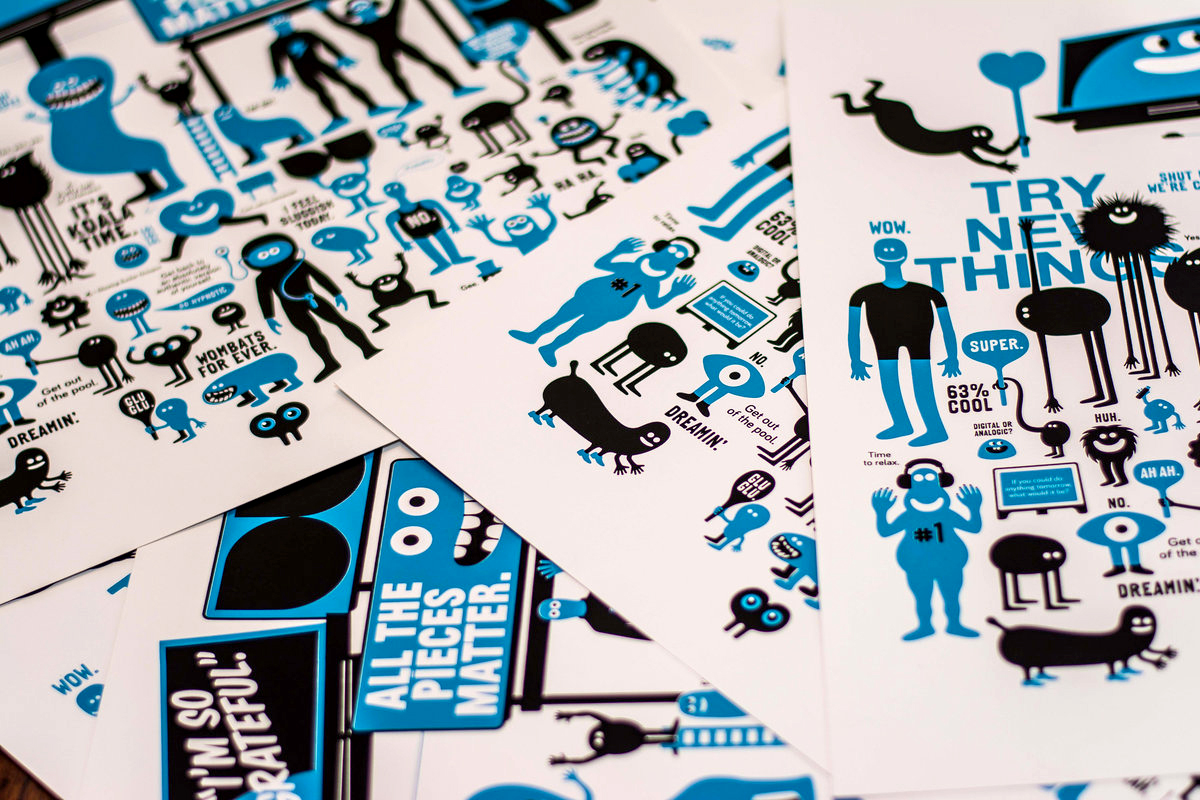
The California dreamin’ of the ’80s and ’90s is primarily defined by skate culture: a style born from surfing, rebellious, rock-inspired, colorful, and offbeat. It successfully revived the practice of screen printing (on skateboards and stickers), with the limitation of a small color palette influencing the choice of illustration: a mix of cartoon styles, hip-hop, graffiti, urban art, stencils, manga, and protest messages. Screen printing, with its accessible technique, played a key role in the widespread diffusion of this culture.
Estria Miyashiro & Buff Monster.
From Steve Rocco’s World Industries (skateboard graphic designer), with its cartoon style to the current screen prints of Buff Monster: featuring characters inspired by Japanese pop culture, cartoons, and flashy colors, the world of street art bursts into the realm of graphic design. Contemporary illustration, comics, and music now intersect and challenge each other in a masterful blend of urban “violence” and popular culture.
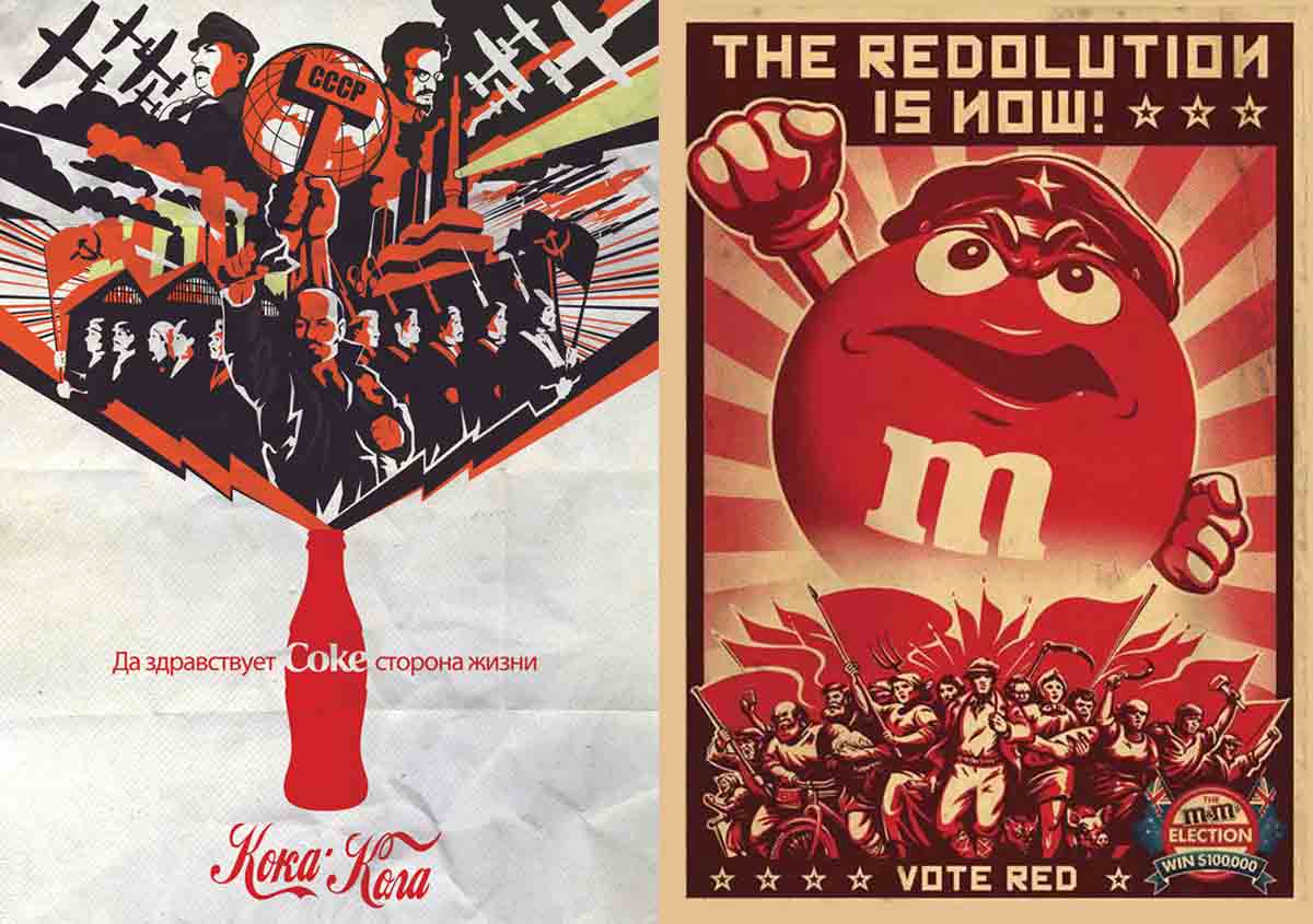
When advertising takes hold of propaganda posters and the aesthetics of screen printing: Coca-Cola, Soviet version by Diego Lauton, and M&M’s Red Revolution’Ad Candydate 2008 by BBDO Australia.
Play it vintage again!
In the Soviet Union, Lenin proved to be a formidable pioneer of modern propaganda. The massive use of screen printing during World War II allowed the United States to produce around 2,500 poster designs, totaling 20 million copies in just over two years—that’s quite an achievement! Meanwhile, the evolution of advertising brought forth great poster artists (Savignac, Morvan, Villemot, Pintori, Key, etc.). While in France, this commercial production was exclusively printed in lithography during the 1950s and 60s (unlike in the U.S. and other European countries), its graphic simplicity still influences the design of illustrated posters today. With the practice of screen printing, the limitation of using a small palette of direct colors helped preserve this style.
Adam Hill, a graphic designer based in Cape Town, creates posters with a distinctly retro style under the name Velcro Suit. Gary Taxali, a true Canadian cartoonist with a subversive tone, launched his first Art Toy in 2005: the Monkey Toy, which included a special edition with a screen print commissioned by the Whitney Museum of American Art in New York. With deliberately worn-in inking and faded color, it’s impossible to get more vintage than that!
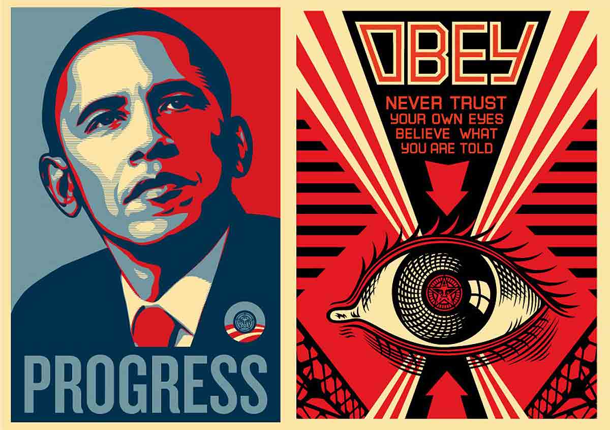
Obey Giant, a Giant of Propaganda
While advertising is a game designed to stimulate and renew desire, propaganda is a far more powerful weapon! Since 1998, it has come to life in the hands of Shepard Fairey in the form of “hypnotic” wrestler posters that confront passersby with a single slogan: “OBEY.” To counter the dominance of brands (while asserting his own), he created an astonishing collection of elaborate visuals on his Obey Giant website, featuring stickers, stencils, and screen-printed posters (discover his studio).
Typographic Design
Is typography Swiss? While the iconic Helvetica owes much to the Bauhaus movement starting in 1919, its use of black-and-white typographic elements and its refined, strict style—dominant in 1970s graphic design—continue to exert their influence today. Typography has become a graphic expression in its own right.
By joining Pentagram in 1991, Paula Scher has consistently juxtaposed photography, lettering, and vibrant, pop-inspired colors. Her posters and typographic compositions, both powerful and sophisticated, have become a touchstone.
Marian Bantjes and the new generation, including Jessica Hische, embody a passionate revival of screen printing and calligraphic lettering. Whether standing alone or blended with illustration, as seen in the works of Nate Williams or Parra, this unrestrained love for hand-drawn typography is everywhere.
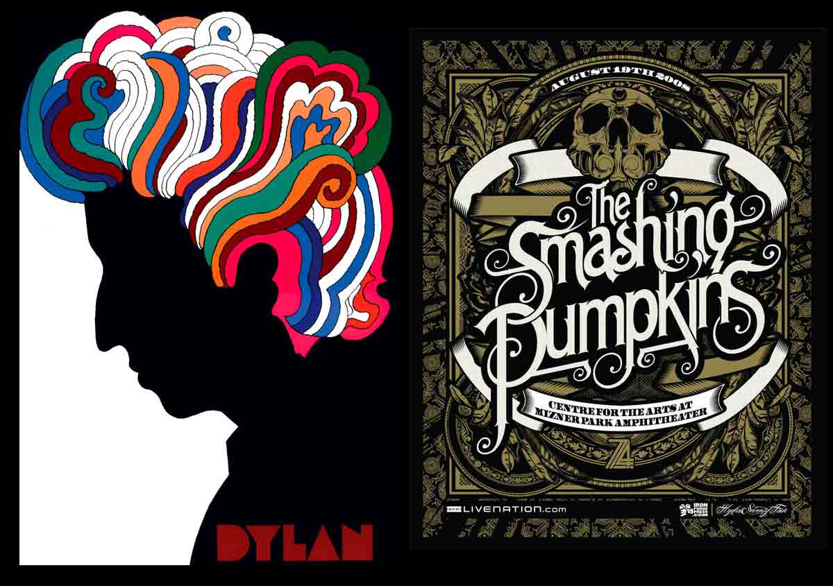
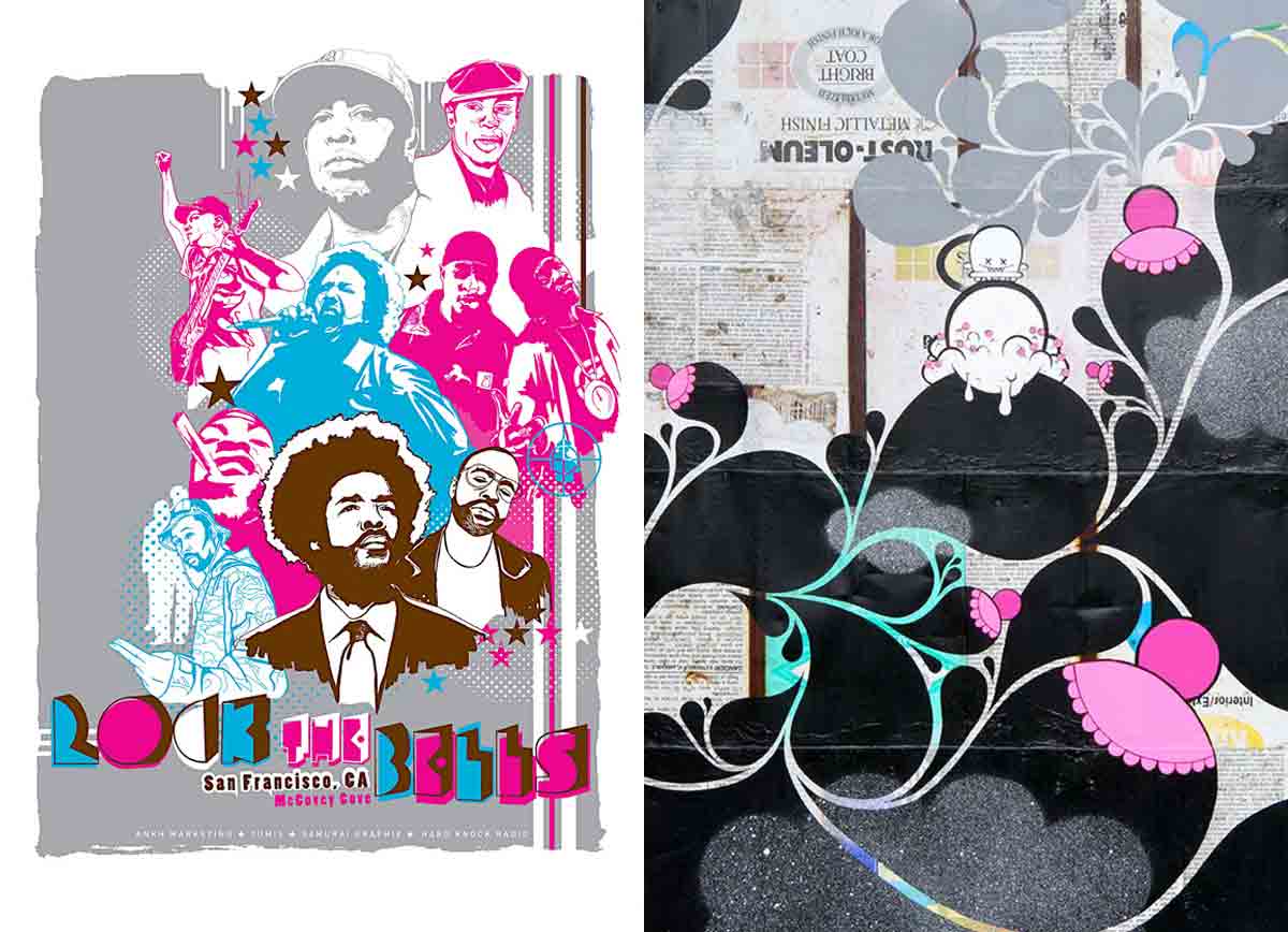
Bob Dylan by Milton Glaser & Smashins Pupkinks by Joshua Smith.
Rock the Screen!
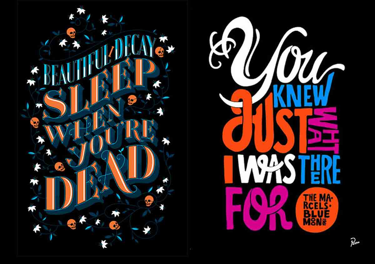
A famous example is Milton Glaser’s 1967 Bob Dylan insert album or the iconic Woodstock poster. After the wave of psychedelic posters in the 1960s and 1970s, screen printing found its main canvas in T-shirts for years. All the iconic skull imagery stems from the influence of punk and hard rock bands like the Sex Pistols, Motörhead, and Iron Maiden. In the 1990s, rock band posters made a major comeback. At the heart of this revival, artists like Frank Kozik and Mark Arminski redefined the visual codes of gig poster, creating posters for rock, punk, grunge, and indie bands: after all, the ripped jeans are perfect for screen printing in a garage!
What makes rock posters (or gig posters) so unique and captivating is their artistic freedom. More than just promotional material, they are an artist’s personal vision, distilling the essence of a rock, punk, heavy metal, or grunge band beyond official merchandise. They stand as a bold statement of counterculture, a rebellious response to the commercial marketing of the music industry. But above all, it’s the tactile quality of screen printing that creates such a visceral connection—an obsession for this graphic art form.
Despite requiring countless hours of meticulous work—often crafted in secret with limited resources—these posters boast exceptional quality. They are far from the kind of prints you casually pin to a bedroom wall! Each concert date becomes an opportunity for local artists to pour their heart and soul into the frenzied, painstaking creation of this underground fan art. In the 1980s, in a bid for visibility, artists fearlessly plastered their precious gig posters on walls and urban surfaces, leaving their mark on the city.
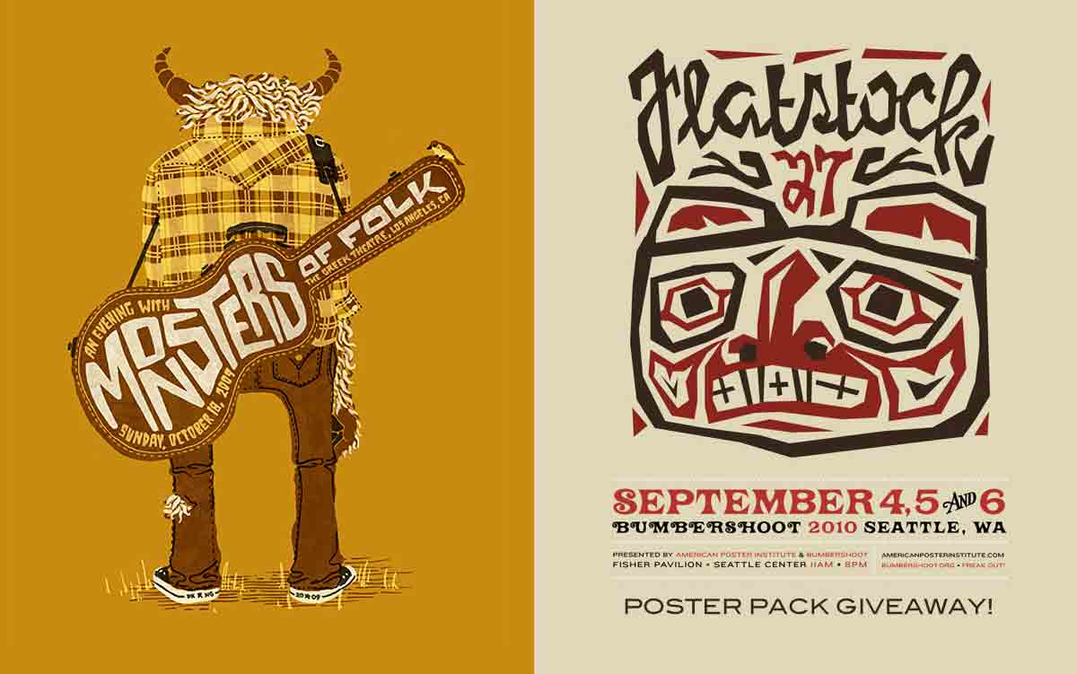
Monsters of folk by DKNG Studios, Flatstock 2010 by Gregg Blackstock.
FlatStock is the festival in the United States, bringing together, since 2002, hundreds of poster-makers united by their shared passion for screen printing and music. When Clay Hayes created GigPosters in 2001, he had no idea he was about to reignite the trend of concert posters and spark a true frenzy for screen prints: the Rock Paper Show was born! (GigPosters has since featured over 8,000 artists and designers). (GigPosters has since featured over 8,000 artists and designers).
Jason Munn: The Master of Minimalism?
Founder of the Small Stakes studio in 2003, this graphic designer made a quiet entrance — yet he’s behind nearly 150 concert posters. All hand screen-printed, their elegance and apparent simplicity continue to surprise, offering a sharp contrast to the usual aesthetic of rock poster culture.
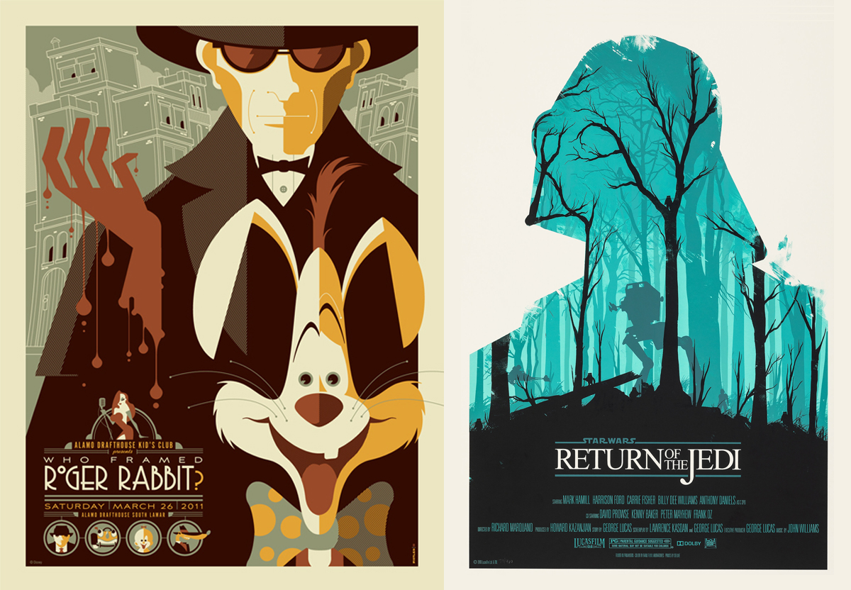
Screenprints of Roger Rabbit by Tom Whalen, Return of the Jedi by Olly Moss.
Screen Printing Steals the Show!
Since the 2000s, with the explosion of the web and social media, a new style of screen printing has emerged: fan art. While artists and graphic designers have always drawn inspiration from popular culture, they now pay tribute to films, TV series, comics, mangas, and video games by creating thousands of alternative posters inspired by iconic works such as Star Wars, Blade Runner, Totoro, Zelda… (the Posterize series showcases some of their finest creations).
These geek posters, screen-printed to perfection, have become an undeniable phenomenon, popularized by publishers like Mondo, Bottleneck Gallery, and Hero Complex Gallery, providing independent artists with a creative space to express their artistic genius and showcase their little treasures!
Since 2011, over 200 screen prints have been dedicated to the Star Wars saga: an endless subject that represents, for any fan, the very essence of the geek poster. These true collector’s pieces, limited edition prints created by Olly Moss, Juan Esteban Rodriguez, Grzegorz Domaradzki, or through the famous poster trilogy by Tyler Stout, can reach a value of $2,000.
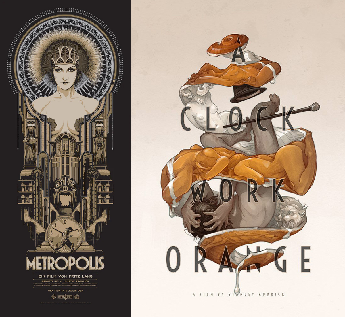
Screenprints of Metropolis by Ken Taylor & Orange mécanique by Wylie Beckert.
The Metropolis screenprint created by Ken Taylor (2017) is one of his rare pieces, produced by Mondo in a limited edition of 400 copies. The Melbourne-based illustrator and designer gained widespread recognition for his film posters, with a particular focus on vertical format posters inspired by gig posters. His vertical, graphic compositions are powerful, and his typographic work shines in the retro-futuristic posters for Metropolis, Nosferatu, and The Bride of Frankenstein, forming a triptych dedicated to cinematic classics.
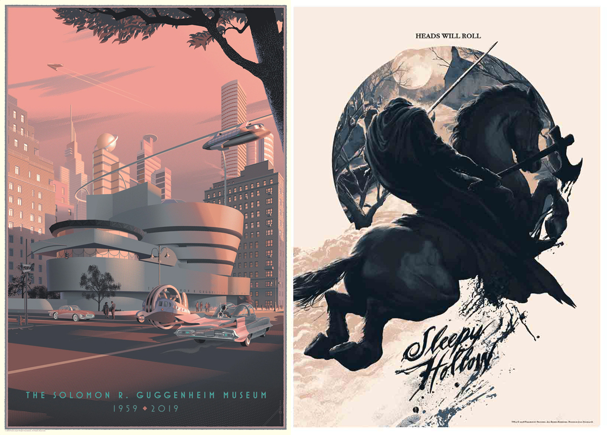
Screenprints of Guggenheim by Laurent Durieux & Sleepy Hollow by Juan Esteban Rodríguez.
Among the iconic figures of this movement are talents such as Ken Taylor, Laurent Durieux, Dan Mumford, John Guydo, Thom Whalen, Nicolas Delort, Fraser Gillespie, Matt Ferguson… whose work constitutes true works of art.
« I know of no other artistic movement where the unofficial works are valued more than the official ones.» (Matthew Chojnacki)
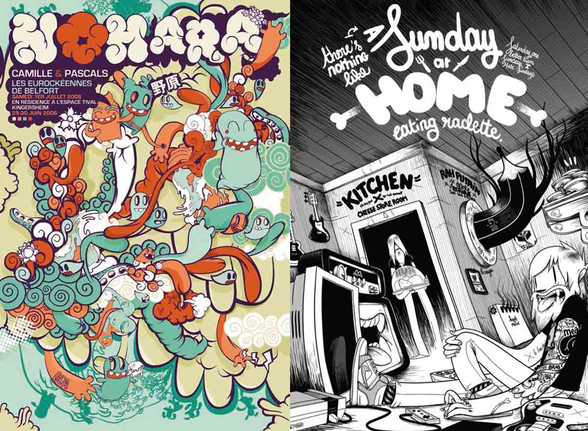
The French Touch of Screen Printing
While in France, the use of screen printing in art is more recent (emerging around 1950), artists and lithographers such as Toulouse-Lautrec and Alphonse Mucha elevated the status of the poster to fine art early in the 20th century, notably with Art Nouveau. Then, new modern art movements emerged—Cubism, Futurism, Dada, Constructivism (Bauhaus), and Expressionism—which profoundly influenced the graphic design of Art Deco.
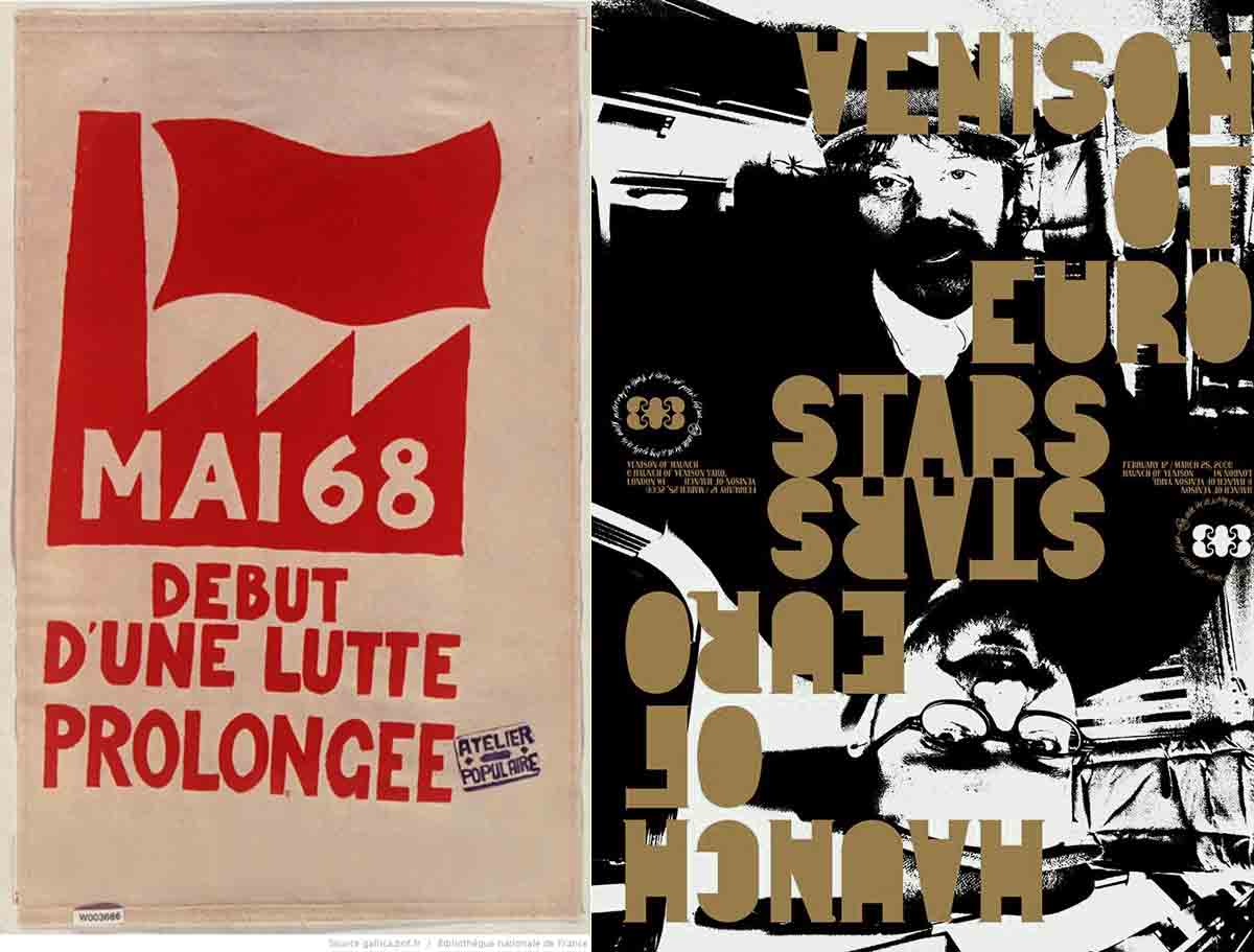
Almost 40 years separate these two screenprinted posters. Graphic designers completely reinvented the use of the technique, leading to visuals like Haunch of Venison by M/M (2006 – 3-color screenprint: black + phosphorescent + gold).
While art screen printing has finally gained momentum, the revival of popular art stemming from May 1968 protests in France played a significant role in this. At the time, the printing process was rudimentary and inexpensive, making it the perfect medium for art students to spread their propaganda, in a style that remains instantly recognizable, and is still repurposed in advertising today!
Many French graphic designers, such as the collective M/M or Philippe Apeloig, have managed to reinvent the poster, asserting its artistic value. By placing typography at the heart of the image, they propose an ongoing search for balance between editorial constraints and a touch of whimsy. All of this is “anarchically” structured, broken down into sequences by lines, ink fills, and blocks of letters, elements that blend perfectly with screen printing.
It is clear that screen printing is particularly well-suited to illustrations (a technique widely used in comics), and, of course, to graphic design! As seen in the work of Geneviève Gauckler, large blocks of color bring a sense of simplicity, while the line drawing, combined with typographic work, creates the characteristic style of posters designed for screen printing.
Other graphic designers, such as Koa or Grems, embrace a colorful style populated by “monsters.” Drips, bulging lines, and vibrant colors create an aesthetic violence directly inspired by American urban culture and manga. Mc Bess, on the other hand, interprets this influence through black ink, creating playful yet finely executed illustrations with a distinctly rock’n’roll style.
Mayumi Otero and Raphaël Urwiller form the duo Icinori. Since 2007, as modern heirs to the “masters of printmaking” and screen printing, they have created intricate, richly detailed illustrations with strong Japanese influences, imbued with surrealism and poetry.
French illustrator and artist Blexbolex is the perfect example of an artist for whom the screen printing technique is integral to the creation of his images, from posters to books. His timeless expressionist style evokes the children’s books of the first half of the 20th century, where the stencil technique was used to color works printed with lithography.
For a Graphic Designer: putting up posters is the ultimate way of putting yourself out there.
A poster can be provocative, political, promote an event (exhibition, performance, concert, film…), or even promote nothing at all! It can also serve as an alternative version of a film or a rock poster, often more valuable than the official one.
While there is always an idea, a play on words, a visual twist, a style, and a sharp sense of composition, the quality of the printed patterns and the sensitivity of the artist also contribute to the value of the work. Using screen printing as a medium has a major impact on the final image and its aesthetic.
« It is one of the noblest ways to create an image. » (François Schuiten)
Lire aussi :
X-Story : l’origine des logos hipster
Retour sur Earthquakes & Aftershocks
L’histoire secrète de la sérigraphie
© Stéphane Constant – mars 2011 / revised and expanded in 2025